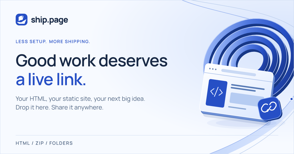
The core idea behind ship.page has always been straightforward: when you finish an HTML page, a prototype, or a static site, you should be able to drop it into a browser or push it through an API and receive a live, shareable link immediately—without a hosting setup project standing in the way.
As of September 24, 2026, ship.page is running on an updated visual identity and interface.
The update spans the landing page, the dashboard workspace, documentation, developer tools, utility pages, and shared social previews. It also introduces a new brand mark: Bow Breeze. Here is the backstory of how the system came together in late September, what we explored, what we set aside, and how the mark took shape.
The Starting Point: September 21
The redesign began with a conversation with Bart on September 21. He felt the landing page and dashboard no longer lived up to how much the product had grown. He asked for three distinct visual directions that would preserve our core blue, feel more sleek and elegant, avoid paper-textured UI surfaces, feature refined SVG finishing, and treat mobile layouts as a first-class citizen.
We developed three divergent proposals:
- Vector: Crisp and architectural, with light-dominant canvases, high-contrast borders, and fine geometric routing lines.
- Current: Midnight navy backgrounds, luminous blue details, and flowing SVG ribbons.
- Studio: Cool porcelain surfaces, graphite typography, sculptural blue panels, and an editorial, gallery-style horizontal dashboard.
Bart chose Current, but not as an off-the-shelf package.
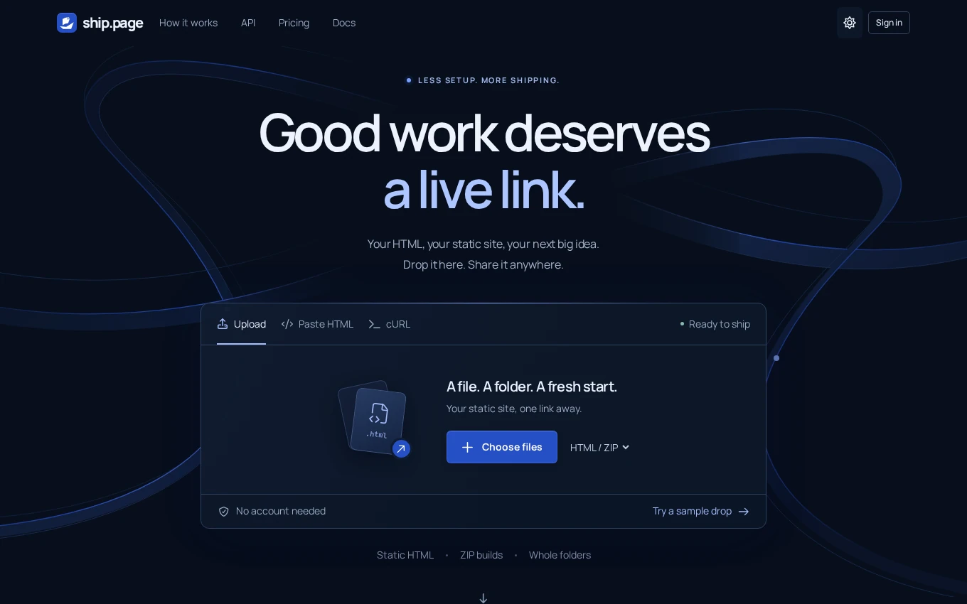
While Current had originally been conceived around a deep midnight-navy palette, Bart asked for an equally considered light version and pointed directly to Studio’s bottom navigation for mobile screens. We merged those strengths: Current became a dual-mode system pairing deep navy with cool whites and deep-blue typography, while the mobile dashboard adopted the bottom navigation bar explored in Studio.
Typography, Color, and the Anatomy of the System
Our primary cobalt brand color (#264FC5) anchors the palette, supported by ice-blue, cool-white, and deep-navy surfaces across both light and dark treatments.
Typography relies on two self-hosted typefaces:
- Manrope serves as our primary typeface across marketing copy and interface controls.
- JetBrains Mono handles code snippets and technical details.
The homepage centers on a single headline: “Good work deserves a live link.”
A working upload workbench sits at the center of the hero composition, accepting HTML files, ZIP archives, and folders directly in the browser alongside the existing API workflow. Rather than floating as an isolated decorative squiggle, flowing SVG ribbons wrap the hero composition.
The primary navigation uses a compact 64-pixel row across viewports, pairing a reduced logo footprint with a borderless theme toggle while keeping touch targets comfortable.
Less setup.
More shipping.
</>#264FC5#E2E9FF#172741#F7FAFF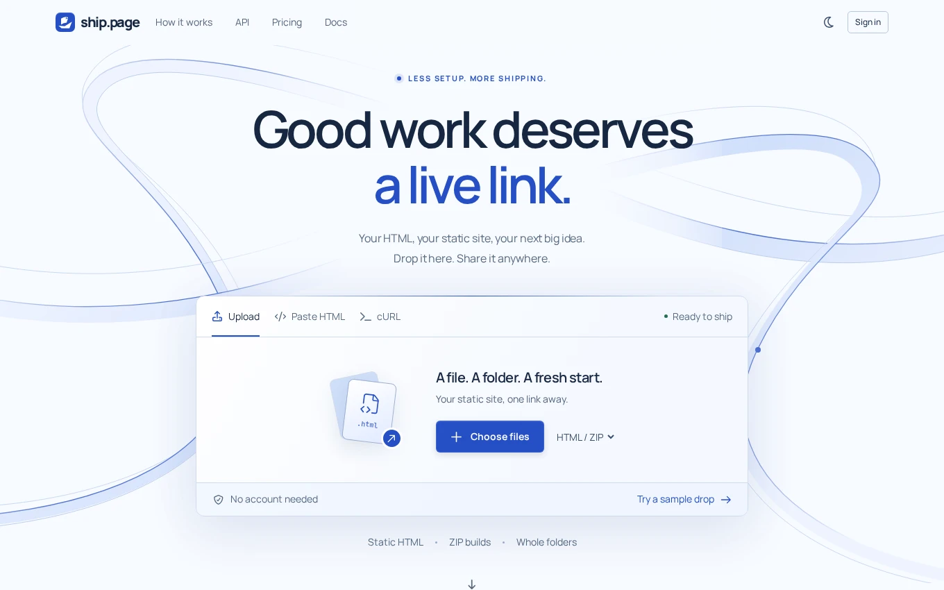
The "Folio" Card Treatment
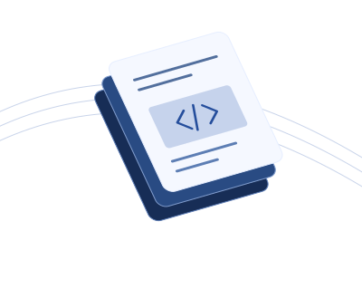
During the initial explorations, we presented several card styles for displaying technical features. One concept, originally paired with a logo concept dubbed Folio, used an inverted background aesthetic built with layered SVG shapes rather than raster graphics.
Bart liked that presentation card immediately and asked for its structure to be reused across the site. (While Folio originated as the name of an early logo proposal, the name stuck to the card style, not the final mark.)
The section titled “Keep your flow. Skip the setup.” became our benchmark for craft across the site. Using the Folio card architecture, we built dimensional vector illustrations—including layered documents, cobalt launch rings, and orbital lines—using varied ink, cobalt, and ice surfaces instead of identical icons on uniform blank cards.
We extended this card treatment through workflow sections, flagship features, and developer tools, down through an illustrated pricing tier grid that stays compact on mobile while retaining price comparisons. A separate section on the landing page provides API examples with copyable HTML, ZIP, and JavaScript tabs alongside documentation links.
At the same time, we maintained restraint where users need to focus: documentation, frequently asked questions, and legal pages remain calmer, reading-focused surfaces.
 Start with your work.
 Give it a live link.
 Send it into the world.
Finding the Mark: From Folio to Bow Breeze
The logo took shape between September 22 and September 23.
Our initial round tested three distinct concepts, each with its own motion behavior:
- Folio: An angled folded-page mark.
- Tack: A minimalist sailboat silhouette.
- Drift: A continuous rounded ribbon.
While the presentation card for Folio was well received, the mark itself did not capture the dual metaphor we wanted. During review, Bart outlined the goal:
"I wish we could make a logo that.. idk, really clearly resembles both the paper/page and a ship or boat."
That prompted a second round focused squarely on the intersection of paper documents and maritime shapes:
- Keel: The original page shape anchored over a wider hull.
- Bow: A page-as-sail above an angular paper hull.
- Origami: A folded paper boat.
Three parallel starting points: folded page, sailboat and ribbon.
Folio stays as a reference while three candidates make the boat more explicit.
The same hull, with a document-style corner folded into the sail.
Compare 0, +2, +4 and +6 units of rightward sail movement on the 64-unit canvas. +4 was chosen.
The straight +4 version beside the final curved sail and smaller corner fold.
Bow emerged as the favorite, balancing the flat geometry of a sheet of paper with the lines of a hull. Refining it took several focused adjustments:
- The Corner Fold: Bart asked for the top-right corner of the sail to fold inward like a paper or document icon, creating Bow Fold.
- Tuning the Crease: The initial fold cut inward too deeply, so we backed the fold point out by roughly 20 percent.
- Sail Offset: We compared horizontal sail offsets of 0, +2, +4, and +6 units on a 64-unit canvas; the +4 version was chosen.
- Windswept Curves: Bart asked for the top and bottom edges of the page to curve slightly upward like a windswept sail. This geometry became Bow Breeze.
- The Final Cut: In the last pass, we reduced the size of the corner fold by another 30 percent, keeping the curved sail, offset, and hull intact.
When the updated geometry came together on September 23, Bart signed off:
"Omfg. We did it. We did it bro. This is it."
The approved mark consists of three paths: the curved folded page-sail, the angular hull, and the small separate corner fold. It works in a single flat color, and comparisons at 16, 32, and 64 pixels were reviewed during the design process.
The mark also has a short reveal animation, with a still version for reduced-motion preferences. It is a signature, not an endlessly moving navigation icon.
The page is the sail.
Each piece is part of the silhouette. No shading is needed to tell the story.
What We Left Behind: The Ocean Hero
Alongside the logo development, we explored animated ocean waves for the hero section, testing an integrated layout with waves and an extra boat.
Ultimately, that direction was removed in favor of the original Current ribbon background and its exact typography and spacing. The production hero relies on flowing ribbons rather than animated ocean waves, suggesting shipping and motion without literal scenery.
Cohesion Across the Platform
The rebrand extends across the broader product surface:
- 61 Social Preview Cards: Restyled with dimensional cobalt rings and browser artwork so the identity continues when URLs are shared.
- The Dashboard: Desktop users get a horizontal workspace layout, while mobile users get the bottom navigation bar adapted from the Studio concept.
- Utility and Reading Pages: Error pages and password utility screens have been brought into the shared visual system, while documentation and guides maintain clean, readable layouts.
- Email Headers: Outgoing claim emails now carry the Bow Breeze mark.
The redesign updates our interface while keeping existing publishing flows intact. When you publish on a Pro account, customer-published HTML is neither restyled nor injected with our branding. The focus remains on giving your work a live, shareable link.
The redesign is live at ship.page. Drop an HTML file into the workbench and see how it feels.